To speak graphic design, you must know its language. It isn’t necessary for non-designers to become fluent, but it’s incredibly helpful to understand the lingo for those of us contributing to and evaluating the art form.
We’re talkin’ to you, copywriters and clients. Your contributions to an ad’s graphic design elements influence its effectiveness. You’re a part of the final product. Your realm is needed in addition to your ability to understand the design processes’ dance moves.
The good news is it’s easy to form a solid graphic design language base by knowing foundational terms and practices. When you have those moves down, you’ll find your writing becomes more visually impactful and your design requests and reviews are streamlined, well-communicated and well-received by your target audience (#adgoals).
There are definitely more than 99 terms we could roll through. Today, let’s go over five biggies we can build stronger fluency upon in the future.
1. Typography
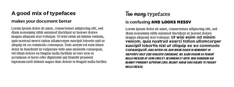
The artistry behind typography ensures the important words that formulate your ad’s messaging are legible, readable and visually entice the reader to do the thing—read it.
Fonts are also referred to as typefaces.
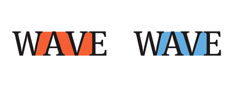
Letter spacing is referred to as kerning.
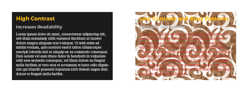
Readability has to do with all of the above, as well as color and backdrop selection.
2. Hierarchy
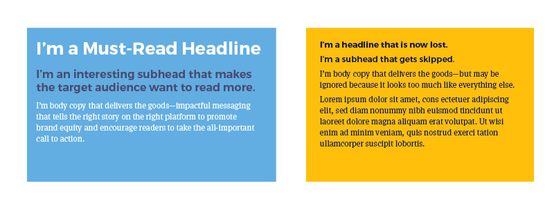
The way ad copy is arranged provides valuable structure—visual cues that pique interest and draw the reader through copy with confidence in its value. The format and the copy should make the reader want to move on to the next sentence, and the next, until they reach your call to action.
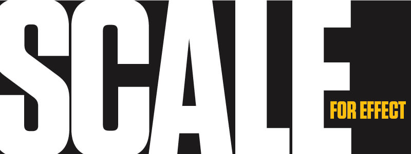
3. Scale
Intentional use of scale in an ad will grab viewers’ attention quickly by creating visual interest in relation to the size of one object compared to another. The impact of scale can be achieved using text and/or imagery.
4. White Space
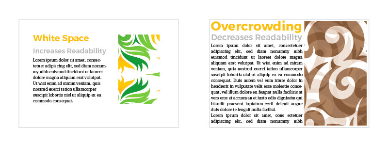
An ad that lacks white space is dangerous enough to warrant a call to your local fire marshal. Okay, it’s not as life threating as an overcrowded elevator, but it’s just as gross and can harm your ad’s effectiveness.
Also known as negative space, white space includes areas of your ad that do not include text or imagery. It provides the target audience room to mentally breathe in your ad space and directs their attention and provides extra focus to your main message.
5. Color Theory
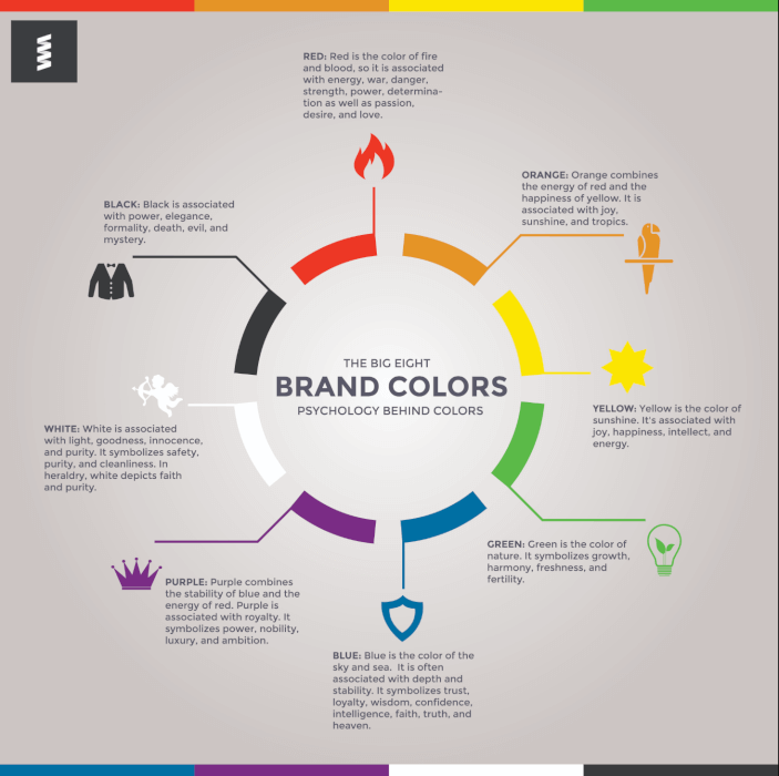
Color theory is comprised of many facets, the most universally relatable of which is emotion. Sometimes, color says what needs to be conveyed without paragraphs of copy. Other times, it supports the written word. Overall, knowing your brand’s why and how you want your target audience to feel about you will influence your color selection. Learn more about design theory terms and techniques that are essential for entry-level designers to be familiar with.
Now that you’re armed with (or reminded of) more graphic design lingo than you had five minutes ago, it’s time to put it into action. Say hello@firespring.com to collaborate with our print and marketing team and check out some recent design successes we’ve created for businesses and nonprofits across the country.

