I’m a designer at heart. Graphic design is one of my passions. I like to “pretty things up”—make them visually appealing and intriguing. Detailed and thought-provoking. Unfortunately, snazzy designs don’t work in fundraising but you can give your fundraising appeal.
Effective fundraising has a simple, no-frills design. I used to think it was ho-hum and old fashioned. I used to fight against it (and failed). But I have embraced the design of fundraising because it works. And I have come to appreciate it for its powerful simplicity, its straightforwardness.
After all, the goal of your fundraising appeal is to earn a monetary gift, not a gold metal for creativity. If your letter has distractions that slow your donor down, she is less likely to give.
Don’t do these 3 things…
- Don’t give her anything else to think about besides making a gift.
- Don’t use words or images that sidetrack her focus away from your offer.
- Don’t strain her eyes.
You need to filter out all obstacles in your appeal message so the decision to give is an easy one. And if your grandmother can read it without trouble, then you’re on the right path! Here’s why.
The average age of donors in the U.S. is 62 years old. This makes sense because younger people have mounting expenses. Plus, their attention is all-consuming—building careers, outfitting homes, raising families.
A shift happens when people reach their mid-50s.
Fundraising expert Jeff Brooks says that “At age fifty-five, people start to become reliably charitable. They’re starting to have some extra money… Then households begin giving to charity. And their giving ramps up until age sixty-five, where it levels off. They’ll continue giving until something intervenes.”
Those of us in our 40s and beyond know what it’s like to have our vision wane. We gradually realize that we need to hold reading materials farther away from our eyes. And we need more light for close-up work. Sadly, I’ve been known to take my MacBook and hold it within inches of my face in the evening. (I’ve heard it referred to as TMB Syndrome – too many birthdays.)
Going easy on your donor’s eyes—no matter her age—will help her get to “YES.”
Here are seven ways to design your fundraising appeal with your grandmother in mind.
1. Pick Matte Paper Stock (Why glossy paper is a dull choice)
Don’t get fancy. Using glossy paper for fundraising appeal letters is a no-no. Matte paper (think “printer paper”) is the way to go!
Matte paper stock for your fundraising appeal letter is a smart practice for 3 reasons:
First, it’s harder to read text on glossy paper than on matte paper—especially for older eyes. Glossy paper catches the light. So, your donor needs to shift the letter while reading to lose the glare.
Second, glossy paper feels like marketing. And nobody wants to feel like they’re reading a slick advertising piece. Traditionally, letters are printed on regular matte paper. You want to keep consistent with her expectation of what a letter looks like.
Third, the perceived cost of glossy paper is higher than matte. In my experience, the pricing of the two are almost identical. But people view glossy paper stock as richer—thus, more expensive. And you don’t want donors to wonder if you are being frivolous with donations.
2. Go With a Larger-Size Font (Forget what you learned in school)
Way back when, you learned that a 12-point font is ideal for school papers and business letters. Well, “Toto, we’re not in Kansas anymore.” Fundraising writing is different.
You want to make it as easy as possible for a donor to move through your letter, right? One easy trick is to increase the size of the font.
No more using the default font size in Microsoft Word. No more picking the size based on the page space available. No more going with the same font size you used on your last appeal letter. No, no, nope!
Go with a 14- or 15-point font. (Yes, I wrote 15!) The fonts themselves vary in style so much, so the size you go with depends on how the font looks in draft form. Don’t be afraid to let your letter flow on to another page.
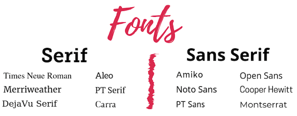
3. Use a Serif Font for Printed Letters (Thousands of book publishers can’t be wrong)
Serif fonts are those with little tails (serifs) at the ends of the letters. Sans serif fonts do not have those flourishes. (Sans means without.)
Serif fonts increase readability and reading speed of text. The serifs help guide the reader’s eyes across a line. It’s hard to believe, but those tiny strokes help our brains recognize words faster.
Look inside several books in your home right now. Chances are that all of them have the main text in a serif font. That’s not a coincidence. Book publishers know what works best when people read a long body of text.
If you love sans serif fonts for their modern look, there’s good news. The lower resolution on computer screens can make the little tails harder to read. So, go ahead and use sans serif fonts for your email messages and website.
Here are some examples so you can see the difference.
4. Black Text is Your Friend (Gray text is your eye-killing enemy)
Resist the temptation to use gray text. (Read that again. And again.)
Designers love gray text because it’s modern and stylish. They are concerned with the artistic quality of the piece. The ease of reading isn’t primary. (And certainly, they aren’t asking older adults their opinions!)
So, you and I need to look out for donors, and only produce a design that builds – not destroys – affinity.
Stick with black in your printed correspondence and on your website. Reducing the contrast between the text and the background colors decreases readability.
Sure, you can use a splash of gray and other colors here and there. But the vast majority of your appeal letter should be in black ink.
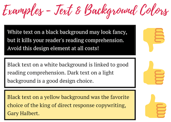
5. More on the Beauty of Black Text (Avoid reverse text like the plague)
There’s another design element you want to stay away from. Graphic designers have popularized reversing the text and background colors. Instead of the traditional black text on white background, the colors are flipped.
While it’s hard to deny the snazziness of reversed text, it could sabotage your appeal. Studies like this one reveal that reversed text is disastrous for reading comprehension. Focusing is difficult because the lines of text can appear to merge into each other.
The goal of your appeal is to earn the donation. Include only the design elements that help your donor understand your offer and lead her to say, “yes!”
6. Break Up Paragraphs (Avoid a scary wall of text)
Are you writing paragraphs the same way you were taught in school? You know, the topic sentence, 3 supporting details, and a concluding sentence?
That design structure may have worked well in school, but it doesn’t cut it in fundraising.
Remember, you want to remove all the stumbling blocks from your appeal letter. A thick piece of text is a turn-off. Donors will completely skip it. You and I both do this all the time. We skim over any text that drags us down.
Help your donors swiftly move through your fundraising message with full comprehension. Do this by breaking up your paragraphs. As a general rule of thumb, every paragraph should not have more than 4 lines of text.
See the two examples below. Dividing up the paragraphs increases readability.


7. Use Photos to Reinforce the Offer (Happy photos produce sad results)
An empty school desk. A woman with her head hung low. An embrace of a member of the military. Like words, photos are powerful. Spend time finding the right photo that reinforces your fundraising appeal message.
If you don’t have a photo available, you can use a stock photo that best reinforces the offer of your appeal. Donors understand that due to privacy issues, your photo may be a representation.
Make sure the photos you choose are either sad or neutral. Happy photos do not convey a need for funding well. All the work you put into your fundraising writing gets diminished with a happy photo. Sad and neutral photos best capture your urgent funding need.
On behalf of all the donors who benefit from your clear, crisp, and concise appeals, thank you for simplifying your designs. Going easy on your donor’s eyes—leading her carefully down the right path—will help her get to “YES.” Download my free fundraising appeal letter design checklist so your letters will always be easy to read.
Need help designing your letters or printing them once they’re designed? Look no further! Firespring has a wide range of capabilities and is the leading source for perfect printed projects from direct mail to signage. Request an estimate today.
This article was written by Julie Cooper. A copywriter and consultant for nonprofits, Julie specializes in fundraising writing, design and donor communications. Her donor-centric copywriting will enable you to send communications that rival even those of the mega national nonprofits.